How to Make an Aesthetic Carrd
Blogging platforms and I have a long history. My first step into the world of online content creation was with Tumblr. If you’re not familiar with Tumblr, it’s a microblogging and social networking site that was particularly popular with millennials during the 2010s. You can follow other users, repost content, and upload your favorite images, videos, GIFs, and audio to your page.
You can find pages dedicated to celebrities, fashion, anime, and even seasons, all aesthetically curated for followers and stalkers to enjoy. Subcultures like Studyblr have even emerged through platforms like Tumblr. Eventually, I moved on to Blogger, and now my content has found a new home with Squarespace. Recently, I stumbled on a site called Carrd. Well to be truthful, I didn’t visit this site on a random day. I found beautiful Carrd images on Pinterest that led me to the site, and since then, I’ve been digging into what this platform has to offer.
What is Carrd
Carrd is a responsive landing page building platform. You can share a mini portfolio, highlight a new product offering, or promote all of your social media platforms on a single beautifully customized page. What drew me to Carrd was the creative possibilities. You can embed songs from Soundcloud, post image galleries, embed videos from YouTube, Vimeo, and Twitch, and adjust the layout to your liking. Like any new platform, it can be difficult to find your footing to make all your creative ideas come to life. That’s why I’m here.
How to Make a Carrd
I’ve been tinkering around on Carrd for a few days and I think I have the hang of it. In this step-by-step tutorial, I’ll show you to make the aesthetic Carrd that is under the list of steps so you’re comfortable with the basics. I recommend having an idea of the images and fonts you want to use to make this process as easy as possible!
Start with a blank canvas
Adjust the background and page (optional)
Add containers
Save and publish
Step One: Start with a Blank Canvas
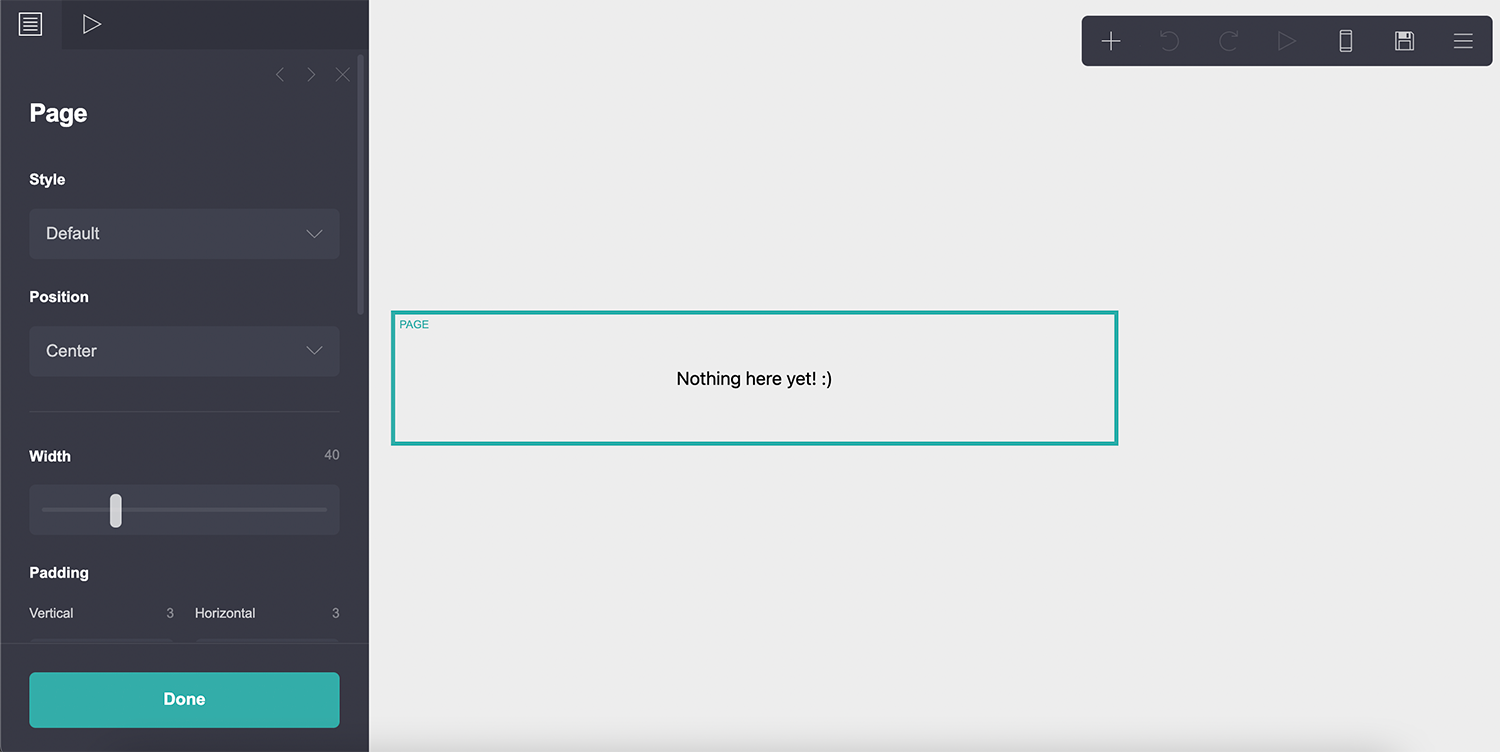
Visit Carrd in your browser, click choose a starting point followed by, ‘blank canvas.’ If you’re new to the site, you’ll see a ton of instructions that may feel overwhelming. Simply click the box in the bottom right corner to confirm you’re ready to get started. From here, you’ll see a small menu in the top right corner. If you click on ‘Nothing here yet,’ another menu will appear on the left side of your screen.
Step Two: Adjust the Background and Page (optional)
Click anywhere on the background to bring up its settings. In this example, I left the background white, but you can adjust the appearance to your liking. For example, you can change the color, use a gradient, add a pattern, or use an image, video, or slideshow. I recommend visiting coloors to find the perfect color palette should you decide to change the background color. Next up, is the page element. The page element is where the site content lives and can be accessed by clicking a space by the text that reads, “nothing here yet!” In this example, I kept the default settings.

Step Three: Add Containers
Containers are the building blocks of your site. You can adjust the appearance of each container (width, padding, background color, etc), then add images, text, GIFs, and more to each one. I recommend browsing existing Carrds on Pinterest or searching for Carrds with Google to get an idea of how you want to customize each container.
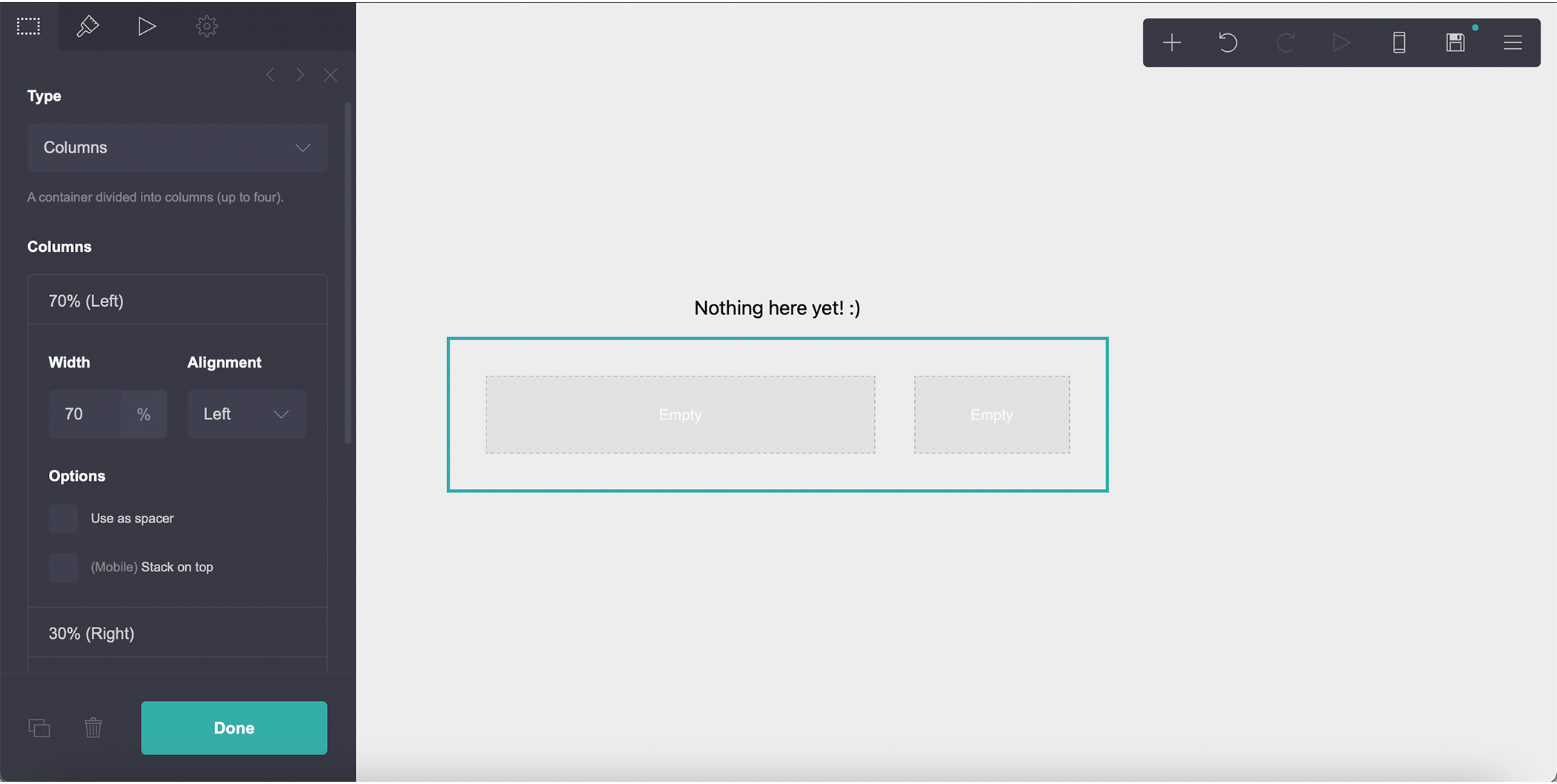
To create the top of the landing page, click the plus (+) at the top right corner of your screen, then click “container.” Click the container and change settings to match the list below.
Type: columns
Columns:
width 70% alignment left
width 30% alignment right
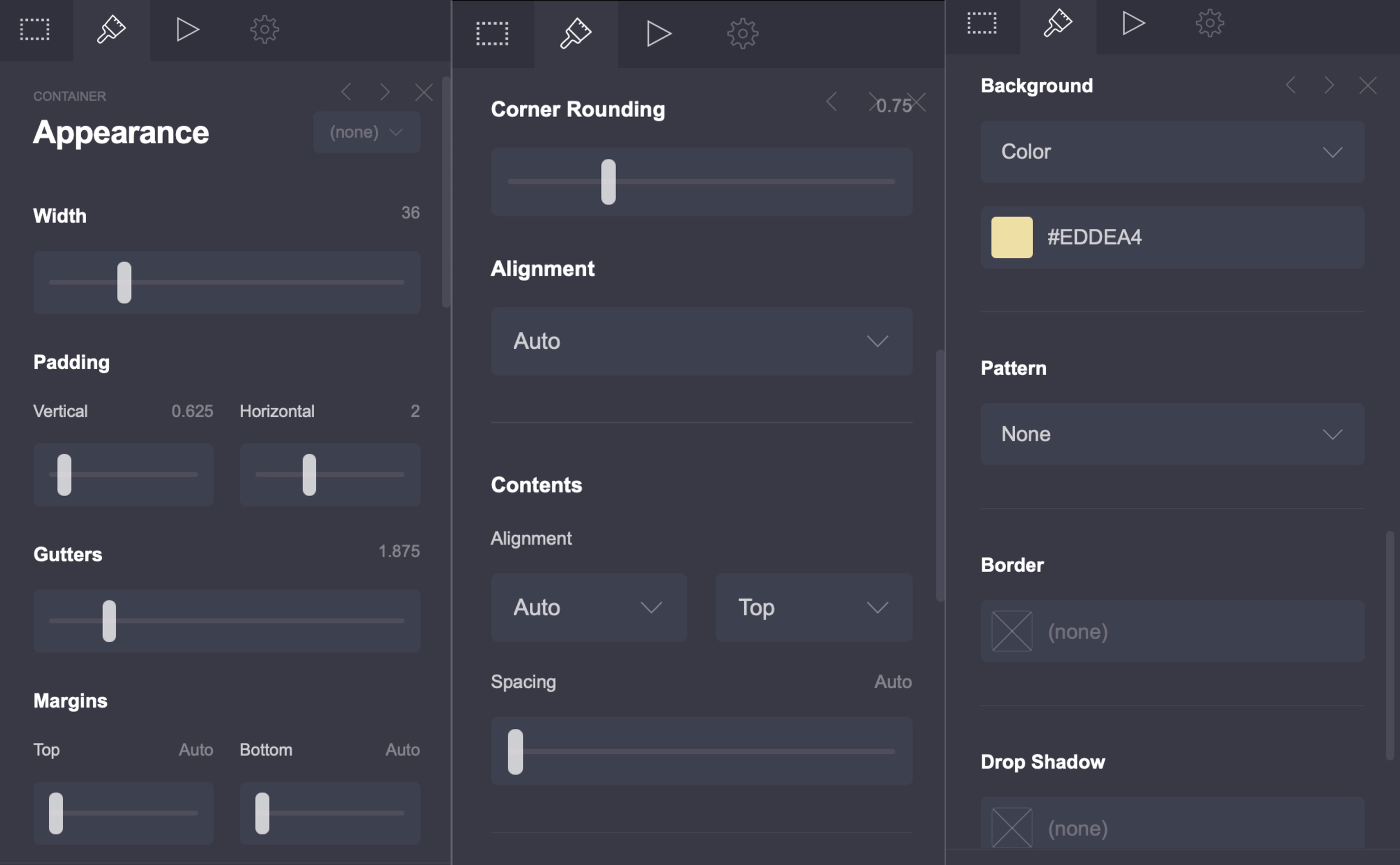
From here, click the paintbrush icon to open the appearance menu, then change each settings to match the list below.
Width: 36
Padding: vertical horizontal
Gutters: 1.875
Margins: top and bottom are set to auto
Corner rounding: 0.75 (this setting will appear after adding the background color)
Alignment: auto
Contents
Alignment: auto and top
Spacing: auto
Background color: #EDDEA4
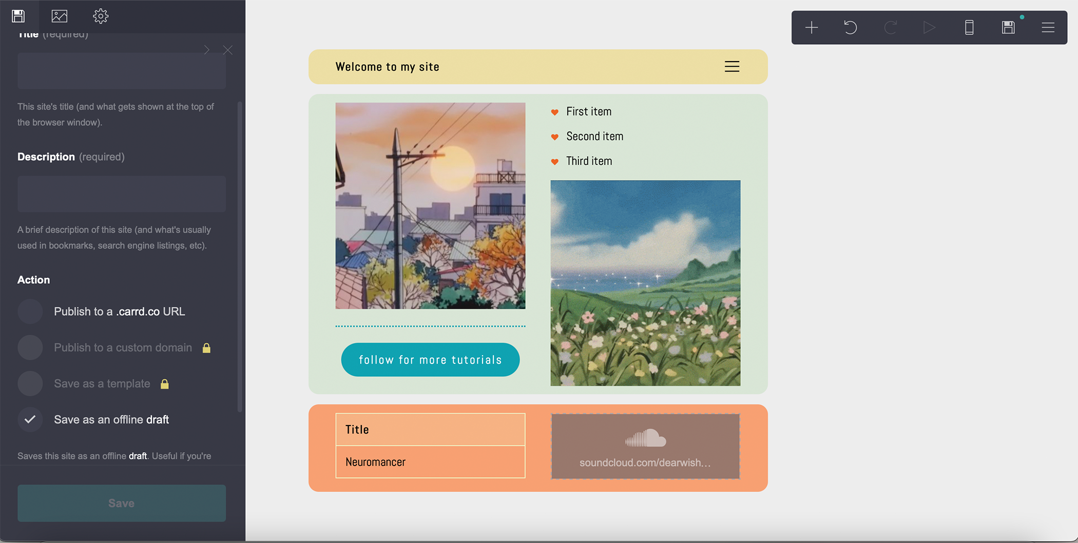
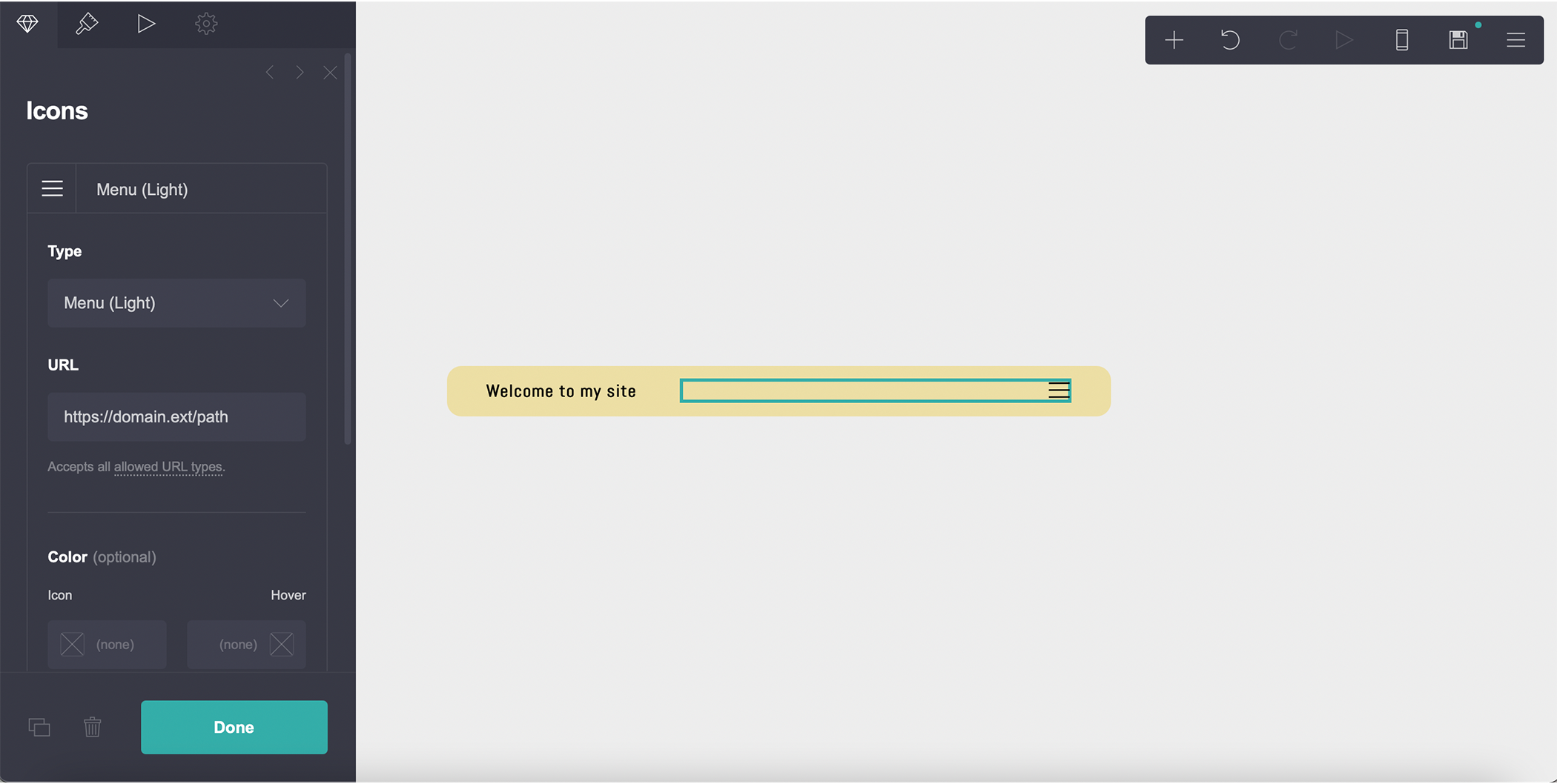
From here, you can drag the default text into the left container and update it to reflect what you want. In this example, I used the font Abel, changed the size to 0.875, and typed, “welcome to my site.” Adding two star symbols (*) at the beginning and end of the sentence will make the text bold. I kept the default settings for the remaining sections. Click the plus (+) in the top right corner then click “icons.” Drag the icon to the right side of the container. I changed the icon type to menu (light). The text and icon position should reflect how we customized the column settings above for this container.
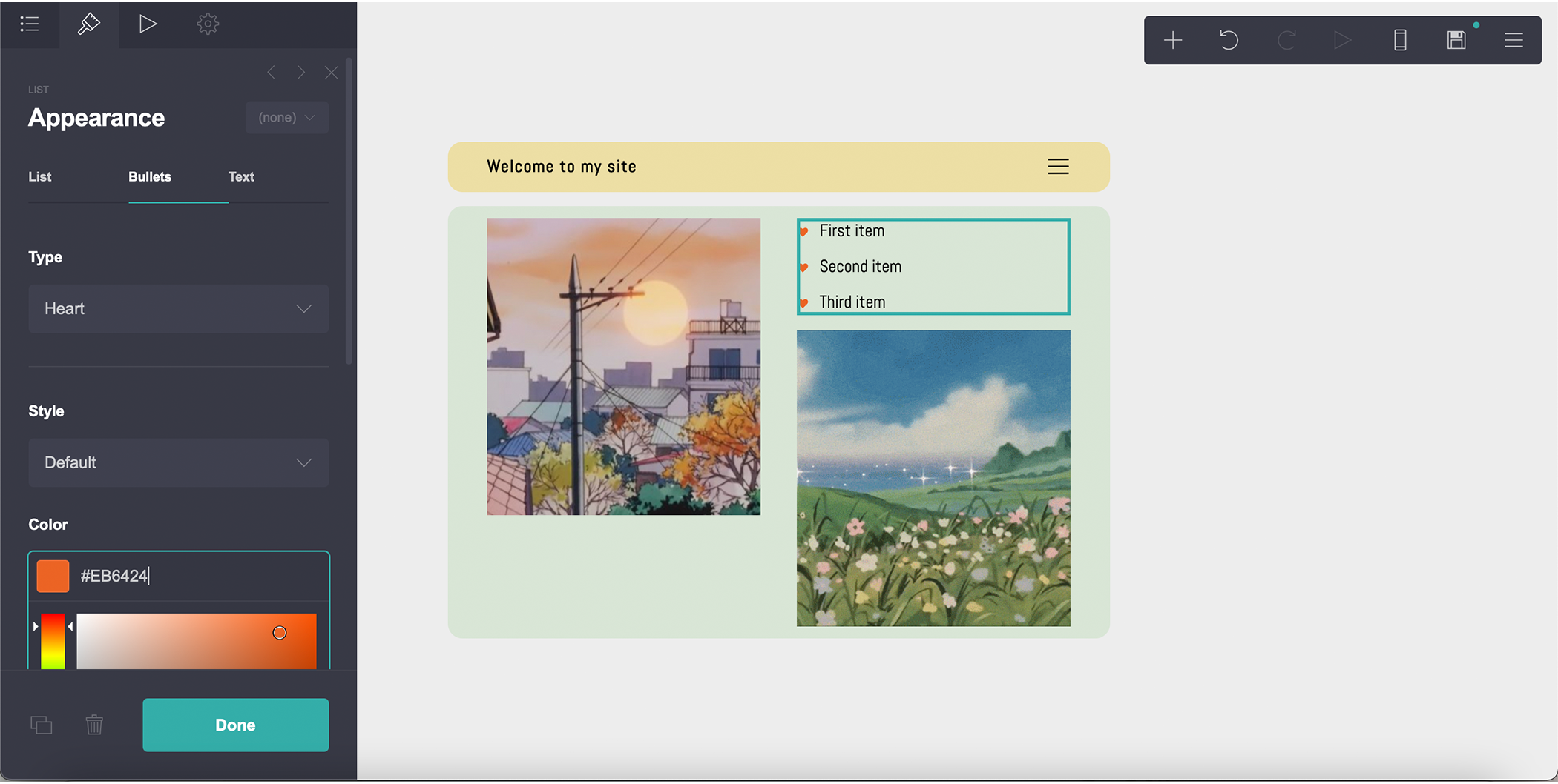
Click the plus (+) at the top right again, add a container, and place it beneath the first container. Change the type to “columns” and click the paintbrush to change the background color. I used #D9E5D6 for the background color. Click the plus (+) at the top right followed by “image” and place the image block in the left container. Repeat this process to add an image block to the right container. Next, click each image block to upload your visuals. I uploaded an image on the left and a GIF on the right and only changed the height of the GIF to 15.25 so it matches the size of my image.

Let’s add a list, divider, and a button to dress up this container. Click the plus (+), then "list” from the options and drag it above the right image, then click the list to change the appearance. In this example, I clicked “Bullets” and change the type to “Heart.” I also changed the color of the hearts to #EB6424.
Next, click the plus sign (+) again and select divider, then place the divider under the image on the left. You can change the style, color, thickness and more. I changed the style to “Dotted,” color to #0FA3B1, and the thickness to 3.

Click the plus sign (+) followed by “Buttons” and move the button under the divider. I changed the label to “follow for more tutorials” and changed the color of the button to match the divider. Corner rounding is set to 2.5, the font I used is Abel, and letter spacing is set to 0.1.

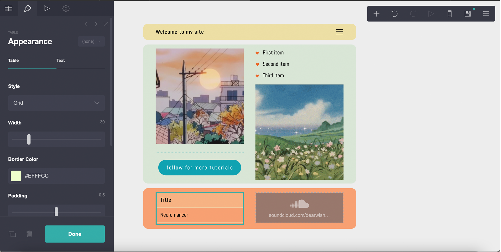
We’ve made it to the last container! Add a new container from the top right menu and place it at the bottom. Then, change the type to column. Keep the default settings for the left and right column then click the paintbrush icon to edit the appearance. I only changed the background color setting to #F7A072. Click the plus (+) then “Audio” and drag the element to a container. I pasted a Soundcloud link, but you can also paste URLs from Google Drive and Bandcamp. Finally, I clicked the plus (+) followed by “tables” and dragged this element to the container on the bottom left. I removed the default text until I was left with the title and one row. Then, I changed the style to Grid and made the border color #EFFFCC.
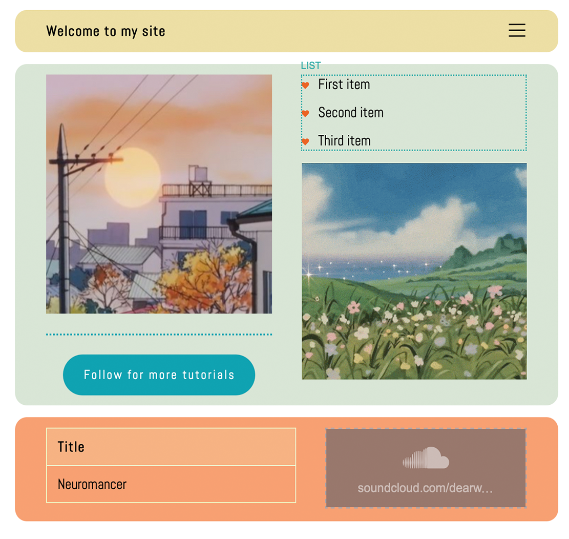
When you’re finished, you should have something like this…

Step Four: Save and Publish
If you’re happy with the results, click the save icon, add a title and description, then check “publish.” Alternatively, you can save the site as a draft. Stay tuned for more tutorials and feel free to reach out with your feedback or suggestions!